Web design never stands still, and 2026 is shaping up to be one of the most exciting years yet. The web is becoming faster, more personal and more expressive, driven by smarter tooling, better browsers and rising user expectations. Whether you run a business site, a portfolio or an online store, keeping an eye on where design is heading helps you stay modern, accessible and competitive. Here are ten web design trends worth watching in 2026 — and practical ways to apply each one.
Watch: 2026 Web Design Trends in Action
Prefer to see these ideas in motion? This short video walks through several of the trends covered below.
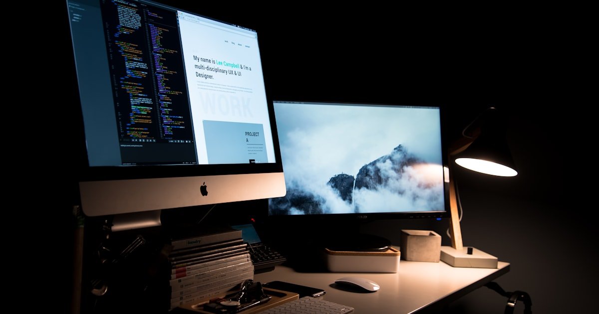
1. AI-Assisted and Personalized Experiences
Artificial intelligence has moved from novelty to everyday workflow. In 2026, AI helps designers generate layouts, copy, imagery and color palettes in minutes, freeing them to focus on strategy and polish. On the front end, sites increasingly tailor content to each visitor — recommending products, adjusting messaging and surfacing the most relevant pages based on behavior. The key is to use personalization thoughtfully: it should feel helpful, not creepy, and never come at the cost of privacy or performance.
2. Bold, Expressive Typography
Type is doing more heavy lifting than ever. Oversized headlines, dramatic font pairings and variable fonts that shift weight and width on scroll give brands a distinctive voice without a single image. Expressive typography loads fast, scales perfectly on any screen and instantly communicates personality. To use it well, establish a clear hierarchy, keep body text highly readable, and let one or two statement fonts carry the character of the page.

3. Dark Mode and Adaptive Themes
Dark mode is now an expectation rather than a feature. Visitors want interfaces that respect their system preference and are easy on the eyes at night. The trend in 2026 goes further with adaptive themes that respond to time of day, ambient light or user choice. When designing dark interfaces, avoid pure black, use sufficient contrast for accessibility, and test that images, shadows and brand colors still look right against a dark canvas.
4. Micro-Interactions and Purposeful Motion
Small animations make an interface feel alive and responsive. A button that subtly reacts to a hover, a form field that confirms input, or a smooth transition between states all reassure users that the site is working. In 2026 the emphasis is on purposeful motion — animation that guides attention and provides feedback rather than decoration for its own sake. Keep it quick, respect the user’s “reduced motion” setting, and never let animation block interaction.
5. Minimalism 2.0 and Generous Whitespace
Clean, uncluttered layouts continue to dominate, but minimalism in 2026 is warmer and more confident. Generous whitespace, clear focal points and a single obvious call to action help visitors understand a page at a glance. The goal is clarity, not emptiness: every element earns its place, and removing the unnecessary makes what remains far more powerful. This approach also improves performance and accessibility as a happy side effect.
6. Bento Grid Layouts
Inspired by the compartments of a bento box, this layout style arranges content into a tidy grid of cards of varying sizes. Bento grids are perfect for dashboards, feature sections and portfolios because they organize a lot of information into a scannable, visually balanced composition. They are responsive by nature and let you highlight important items with larger tiles while keeping everything neat and modular.
7. 3D and Immersive Visuals
With faster devices and better browser support, three-dimensional elements, subtle depth and interactive product views are becoming mainstream. A rotating 3D product, a layered hero with parallax, or gentle depth on cards can make a site feel premium and memorable. Use these effects sparingly and optimize them carefully, because heavy 3D assets can hurt load times if left unchecked.
8. Accessibility-First Design
Accessibility is no longer an afterthought — it is a starting point. Designing for everyone means sufficient color contrast, keyboard navigation, descriptive alt text, clear focus states and content that works with screen readers. Beyond being the right thing to do, accessible sites reach a wider audience, rank better and are simply easier for everyone to use. In 2026, teams build accessibility into their design systems from day one rather than patching it later.
9. Sustainable, Performance-First Design
A growing awareness of the web’s environmental footprint is pushing designers toward leaner, faster sites. Sustainable web design means optimized images, efficient code, minimal third-party scripts and thoughtful use of video. The benefits compound: a lighter site loads faster, costs less to host, ranks higher and consumes less energy. Performance and sustainability are now two sides of the same coin.
10. Vibrant Color, Gradients and Glass Effects
After years of muted palettes, bold and joyful color is back. Rich gradients, soft glassmorphism (frosted, semi-transparent panels) and vivid accent colors add energy and depth while keeping interfaces modern. The trick is balance: pair vibrant hues with plenty of neutral space, and always check that text remains readable against colorful or translucent backgrounds.
Honorable Mentions
- Scroll-telling — narratives that unfold as you scroll, guiding users through a story.
- Custom illustrations and brand mascots that set a site apart from stock imagery.
- Voice and conversational interfaces for hands-free interaction.
- Variable and kinetic fonts that animate weight and spacing.
How to Apply These Trends Without Overdoing It
Trends are tools, not rules. The best sites adopt them selectively in service of their goals rather than chasing every fashion at once. Before adding a trend, ask whether it improves clarity, usability or brand expression — and whether it will still look good in two years. Layering five different effects on one page usually creates noise; choosing one or two signature ideas and executing them well creates impact.
Start with solid fundamentals: a clear hierarchy, fast load times, accessible color and typography, and a mobile-first layout. Then introduce a trend or two that fits your brand. Test on real devices, gather feedback, and measure the effect on engagement and conversions. A trend that does not move your metrics is just decoration.
Designing for Mobile, Tablets and Foldables
The majority of web traffic is mobile, so 2026 design starts on the small screen and scales up. Beyond standard phones and tablets, foldable devices and ultra-wide displays are becoming common, which means layouts must adapt gracefully to a much wider range of sizes. Touch targets should be comfortably large, navigation should stay within thumb reach, and content should reflow rather than simply shrink. A mobile-first mindset also forces healthy discipline: if a feature does not earn its place on a small screen, it probably does not belong on the page at all. Test on real devices, not just the browser emulator, and pay attention to how your design behaves when a foldable opens or an orientation changes.
Tools to Help You Keep Up
Staying current is easier with the right toolkit. Modern design tools now bundle AI assistants, auto-layout and shared component libraries that keep teams consistent and fast. Page builders such as Elementor let you apply many of these trends — bold type, motion, dark sections, bento-style grids — without writing code, while design systems keep your colors, spacing and components reusable across every page. Pair these with performance tools like Lighthouse and an accessibility checker, and you can adopt new ideas confidently while protecting speed and usability. The designers who thrive in 2026 will not be the ones who chase every trend, but the ones who combine strong fundamentals with the handful of trends that genuinely serve their audience.
Final Thoughts
The throughline for 2026 is intentional design: faster, more accessible, more personal and more expressive, but never at the expense of the user. Bold typography and vibrant color give brands a voice; minimalism, accessibility and performance keep that voice clear; and AI and personalization make the experience feel tailor-made. Pick the trends that align with your audience and goals, apply them with restraint, and you will build a site that feels fresh in 2026 and still holds up for years to come.
Contributor at WowPixelTheme — sharing tips, tutorials and product updates.